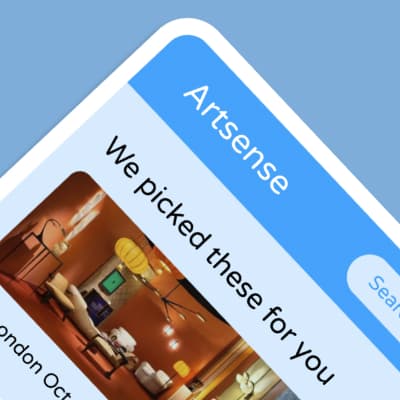
Artsense
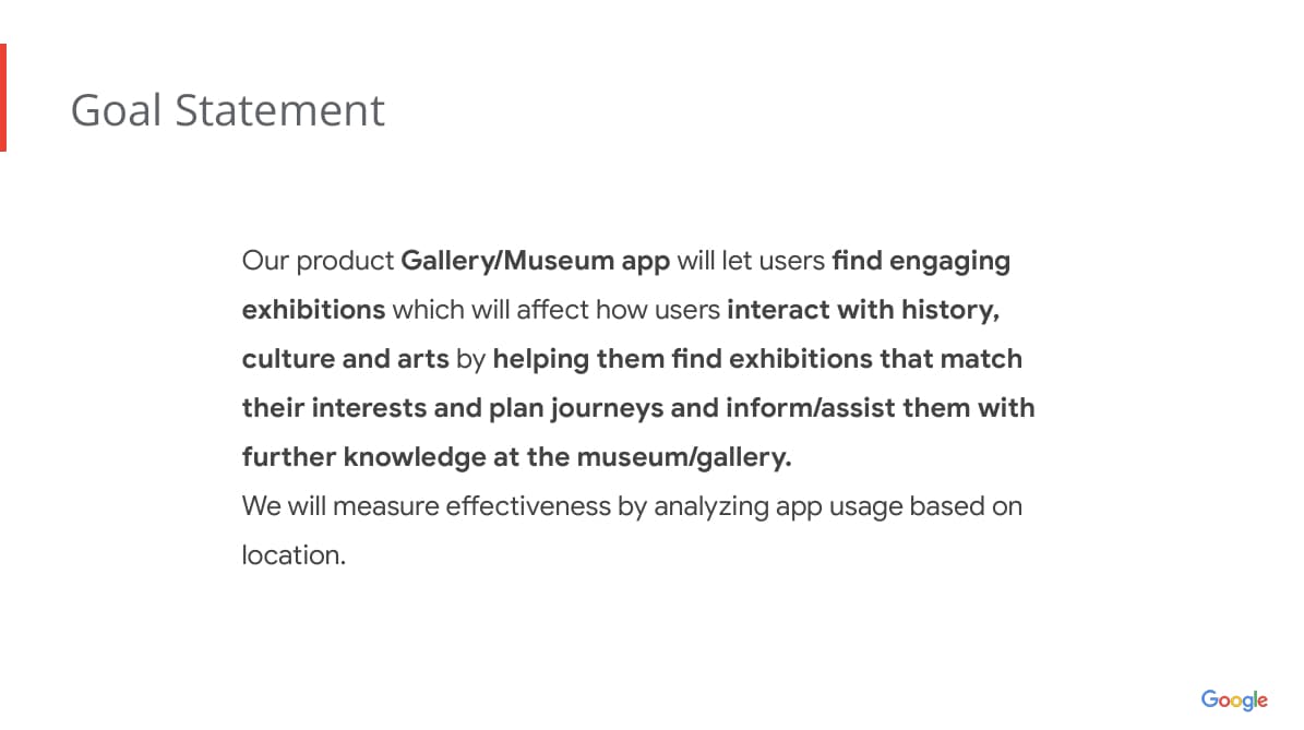
This case study was developed during my study in the Google Professional UX Design Certificate. The aim of this app was to develop an inclusive and accessible platform that enables all users to discover and book enjoyable exhibitions and art galleries tailored to their preferences and interests, while also enhancing their learning experience during the event.
Design System

The project is a work in progress, and I will continuously update this page as I refine and enhance my designs. Below, you will find some of my case study slides, along with links to my low-fidelity and high-fidelity prototypes. To view the complete study, please click the link at the bottom of the page.
Product Development Life Cycle

Empathise/Brainstorm
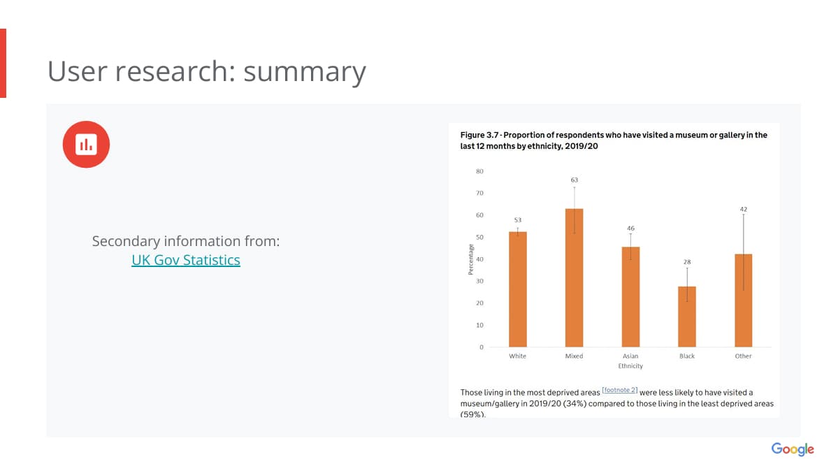
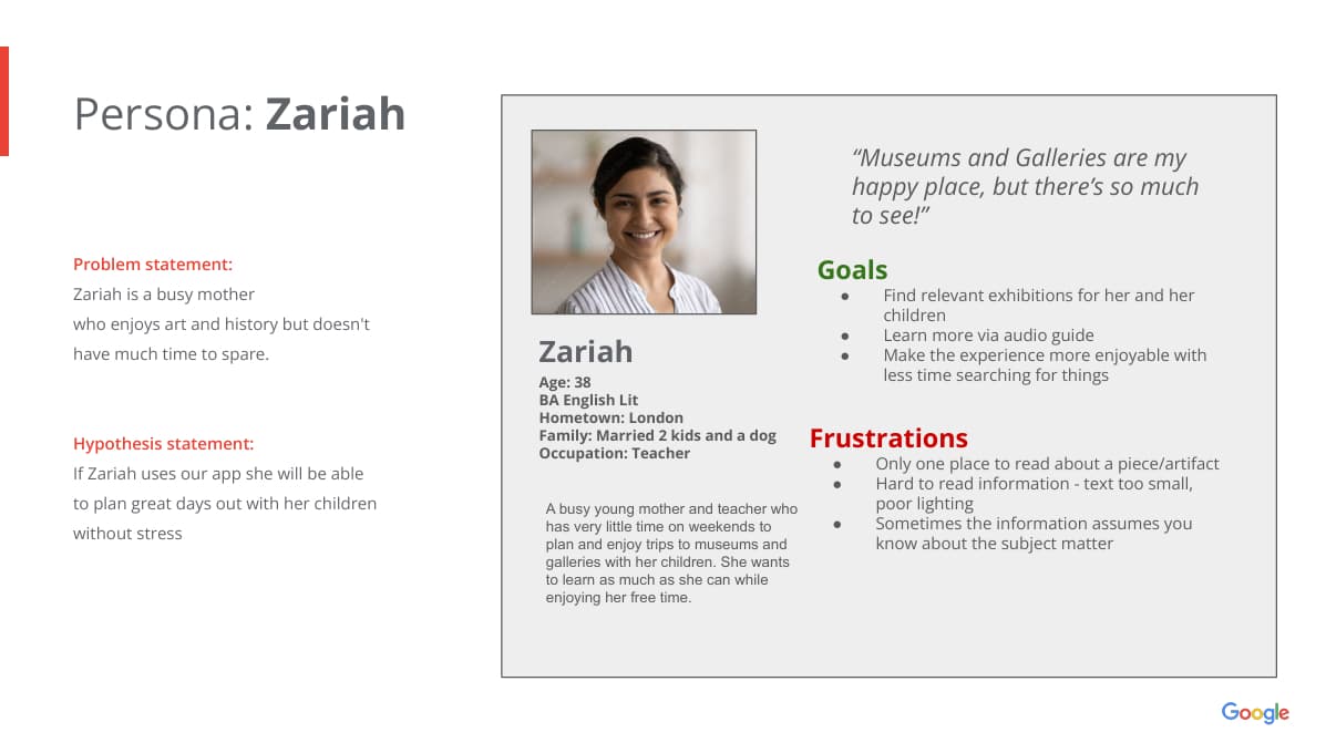
The idea for this app was developed based on interviews and secondary research, including data from the UK Government website. This research highlighted a significant lack of engagement and interest in museums and galleries among young people and individuals from deprived areas.
Define

Ideate/Design
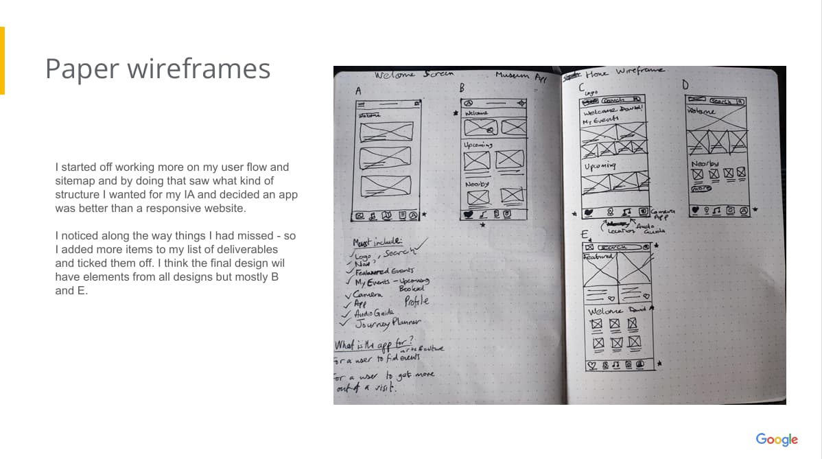
Prototype

- For you section uses larger scale images for emphasis.
- Gestalt Principle: Common Region
- Typeface: Segoe UI
- Page Header: 20px
- Section Header/CTA: 18px
- Text: 14px
- Small Text: 12px


- Back, save/like, share buttons use the accent colour.
- Centred CTA buttons for ease of use.
- Using scale for emphasis.