KENSINGTON TEMPLE · CHARITY · APP AND GIVING
Making a big organisation easy to reach
A simple app for members and a clearer way to give, for a London church with thousands of pages online.
- Role
- Head of Web: designer and front-end developer
- Organisation
- Kensington Temple, London (charity, about 100 staff)
- When
- 2005 to 2021 (app: 2019 to 2020)
- Built with
- Figma, React Native (Expo), WordPress REST API
01
The challenge
Kensington Temple is a large London church that also ran a theology school, a nursery, a cinema, a retreat centre and more. I ran its web: the main site, live streaming, online giving, and sites for many of its departments.
The main site had grown to thousands of pages and posts. Members, many of them older, struggled to find the few things they came for: the latest sermon, the live service, what’s on, who to call and how to give.
02
One button for each need
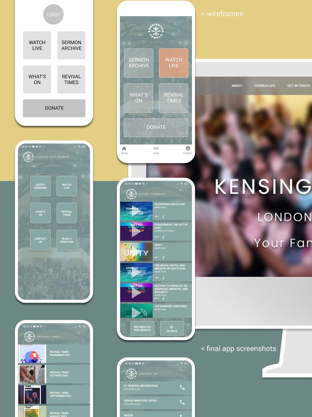
I designed a home screen with a few large buttons, one for each of those needs, and nothing else. I took it from wireframes to final screens in Figma.
03
Building it myself
This was my first app outside WordPress. I built it in React Native with Expo, working with a front-end engineer who reviewed my code and helped with the harder parts, like screens that adapt when the phone turns. Most of the code, across more than 30 pull requests, was mine.
The app pulls sermons, the monthly magazine and contact numbers straight from the WordPress site, so the team never had to update anything twice.
04
Testing with older members
I tested it with some of the older members of the congregation, and they responded well: it was simple enough to use without help. It was still in testing when I left in 2021, so it was never released.
05
A clearer way to give
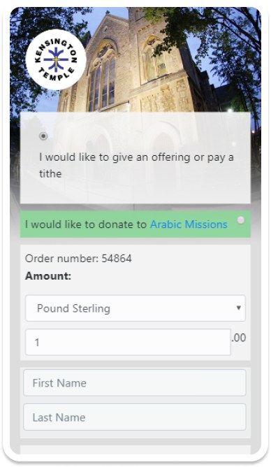
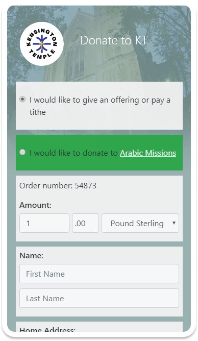
Online giving brought in between £1M and £3M a year, so small changes mattered. The original was a three-step PHP form. In 2019 I made it clearer: a heading that says what the page is for, amount and currency on one line, related fields grouped, and help on each field.
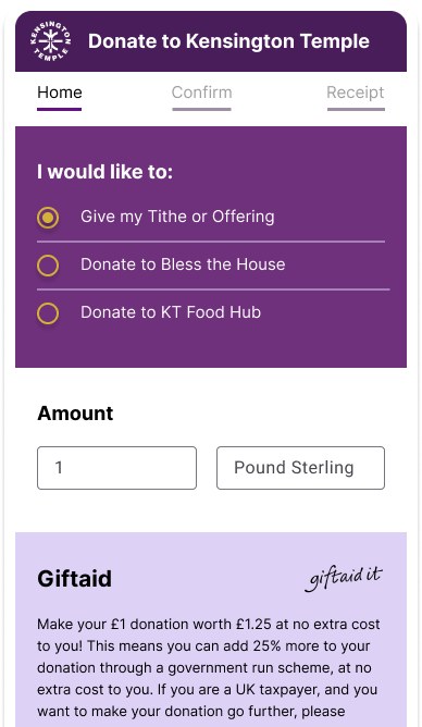
Later I sketched how I would take it further: a progress bar (Home, Confirm, Receipt), more weight on Gift Aid, which adds 25% to a gift at no cost to the giver, and one clear button.
06
What it taught me
Designing for people who aren’t confident with technology means cutting, not adding. Building it myself showed me how design decisions play out in code, which is how I still work today.