Help comes first
Support for people who need it sits near the top, before any ask for money.
WE ARE STRONGER · CHARITY · BRAND REFRESH
A volunteer project for an anti-bullying charity. The brief was to look more professional, so I learned from the biggest children’s charities, borrowed what worked, and changed one thing for this audience: help comes before the ask.

01
Start
We Are Stronger supports people affected by bullying, with free emotional and legal support. It’s run by professionals who volunteer their time, and I joined them at no charge. The CEO had one request: a more professional-looking website.
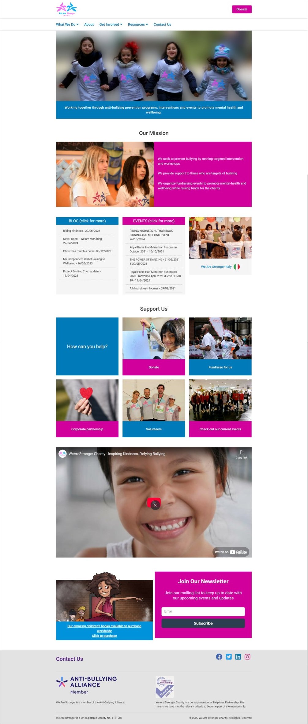
The old site was crowded and loud, and someone who needed help had to dig for it: blog lists, events and fundraising tiles competed for attention, and support was hard to find.
It had to feel trustworthy to parents and teachers without feeling clinical to a teenager, and still give supporters a clear way to give.
02
Research
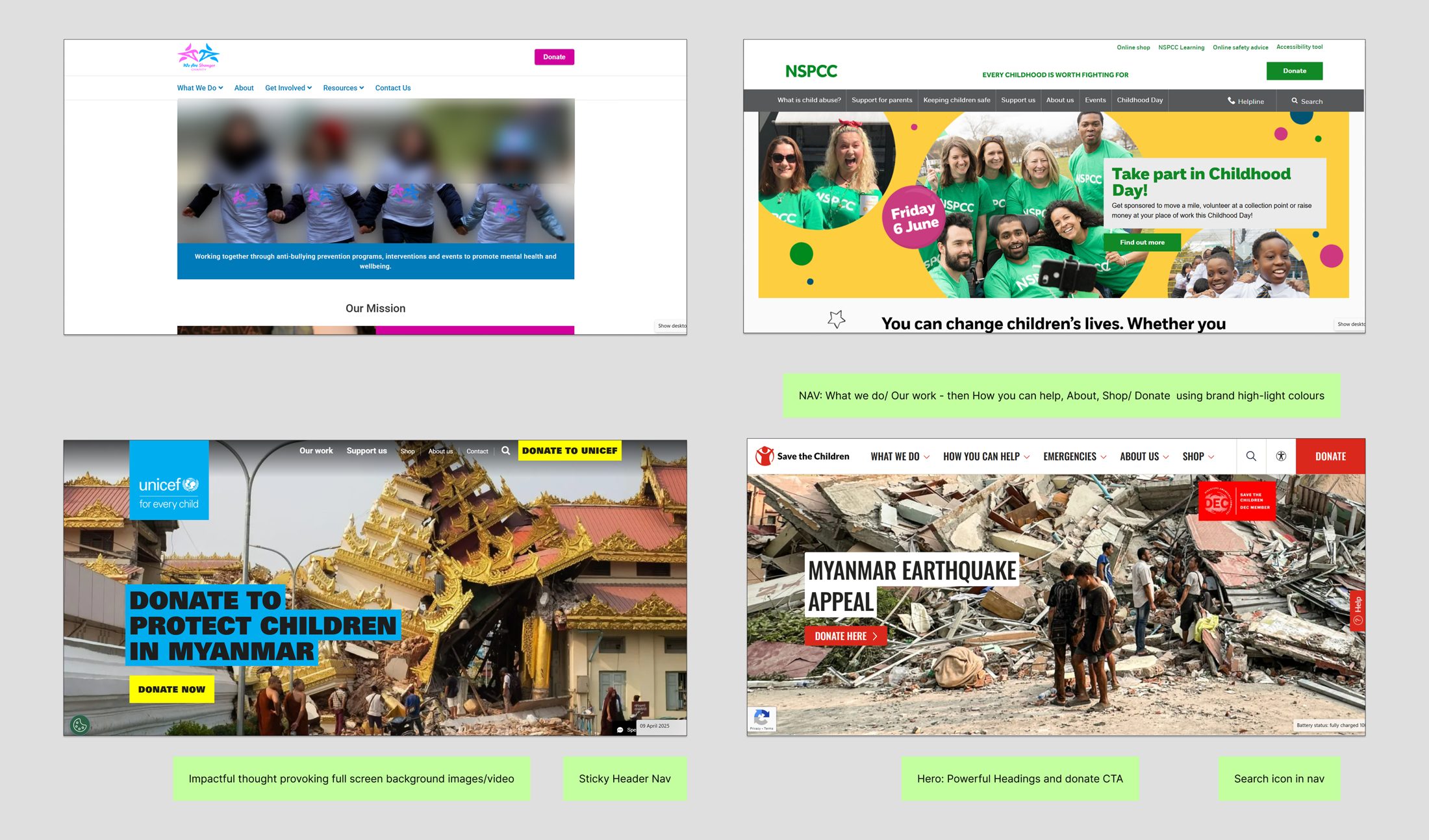
“More professional” is hard to design to on its own, so I went to the most professional examples I could find: the big children’s charity sites, NSPCC, UNICEF and Save the Children. They have large teams and years of testing behind them, so their patterns are worth learning from.
I noted what they had in common. A short, clear navigation: what we do, how you can help, about, then donate, picked out in a brand highlight colour. A sticky header, so donate and search are always in reach. Big, thought-provoking images or video. And a powerful headline with one clear call to action.
03
Ideate
My first direction took those patterns at full volume: a full-bleed photo, bold upper-case headlines in highlight boxes, the charity’s pink and blue at full strength, and support and donate front and centre.
It was strong, but it looked like a big appeal, and that isn’t what this site is for. A young person looking for help after being bullied shouldn’t land on something that shouts. So the second direction kept the structure and calmed everything else: softer pink and lilac tints, sentence-case headings, a quieter hero, and room to breathe.

04
Decide
The big charities lead with an appeal because most of their visitors are supporters. Here, the first visitor might be a child or a parent who needs help today. So I kept what works, a clear navigation, search and a highlighted Donate button, and changed the order: a Find help now section sits straight after the mission, before any ask for money. Fundraising comes after, framed as “It’s only possible because of friends like you”.
05
Support for people who need it sits near the top, before any ask for money.
Softer tints and a gentler hero, with the brand colours kept for what matters.
A simple heading style ties every section together, so the site reads as one system.
Highlighted in the header on every page, so supporters never have to look for it.
06
Ship
The design took a few weeks, part time, to create and get approved. I then built the development site in WordPress with the other developer, while our SEO manager ran the project and wrote the content. After that I handed it over to another team, who finished it and took it live.
The live site keeps the calmer look and the Find help now section near the top.